Heinz Ronner / Sharad Jhaveri. (1987). Louis I. Kahn Complete Work 1935-1974. Birkhauser
概况
凯·金贝尔是一位工业家、艺术品收藏家,也是金贝尔艺术基金会的创始人。1964年,金贝尔去世。 1966年初,博物馆馆长理查德·法戈·布朗博士找到路易斯·康 。在采访了许多著名的建筑师后,金贝尔艺术博物馆做出了决定。委员会的合同于10月6日签订。1966. 在这样的条件下,路易斯·康将与当地的建筑和工程公司Preton M. Goren Associates合作。
最终的施工图预计在1967年底完成,工程预计在1968年初开工。事实上,直到1969年6月29日破土动工,工程才开始动工。博物馆于1972年10月4日正式开放。
科缅丹特博士是该项目的结构顾问工程师。在三年的博物馆设计的演变和完善过程中, 路易斯·康制定了四个不同的方案:直到1967年春天,他一直致力于正方形方案的设计;直到1967年6月,他一直致力于矩形的方案设计;直到1968年8月,H方案和1969年夏天的C形方案。
Kay Kimbell, industrialist, art collector and founder of the Kimbell Art Foundation, who died in 1964 charged in his will that trustees build a museum of the first class in the city of Fort worth.Museum director Dr Richard Fargo Brown, approached Louis Kahn in early 1966. after having interviewed many wellknown architects, for the decision of the Kimbell Art Museum. The contract for the commission was signed on October 6. 1966. under the condition that Kann would work in as sociation with the local architectural and engineering firm of Preton M. Goren and Associates.
Final working drawings were expected to be ready by the end of 1967 and the construction was to have started in the beginning of 1968.In fact construction did not begin until the June 29,1969 ground- breaking. The museum officially opened on october 4 1972.
Dr August Komendant worked as a consulting structural engineer for the project. During the three-year evolution and refinement of the museum design, Kahn developed four distinct plans: he worked on the Square-plan until spring 1967,the Rectangle-plan until June 1967; the H’-plan until August 1968 and the ‘C-plan until the summer of 1969.
方形方案
SQUARE PLAN
KAM. 1
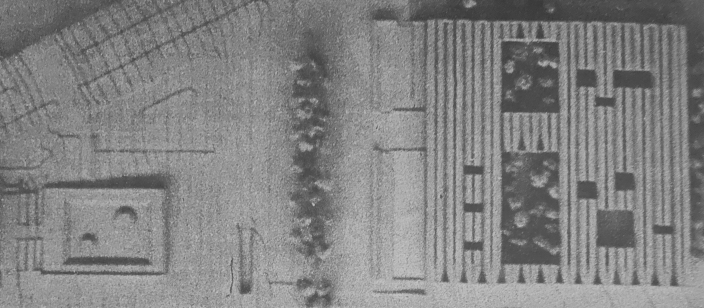
1967年春季,场地模型平面图,展示了一个十四跨度。v形折叠板屋顶结构(420平方英尺),顶部有光缝,在南北轴线上对齐,采光庭院和雕塑花园保存现有树木;广场西面是带水池的入口,左边是阿蒙卡特西方艺术博物馆。
Plan view of site model, spring 1967, showing a fourteen-bay.V-shaped folded plate roof structure (420 feet square) with top light slits, aligned on a north-south axis, light courts and sculpture-gardens preserving existing trees; the entrance with water pools to the west of the square and The Amon Carter Museum of Western Art to the left.
KAM. 2

场地模型的透视图,1967年春季,展示了拱形的南立面,v形折叠板梁形成了拱顶(30英尺高)和顶部的裂缝:入口和左边的倒影水池。
Perspective view of the site model, spring 1967, showing arched south facade, v-shaped folded plate girders forming vaults (30 feet high) and toplight slits: the entrance with the reflecting waterpools to the left.
KAM. 3
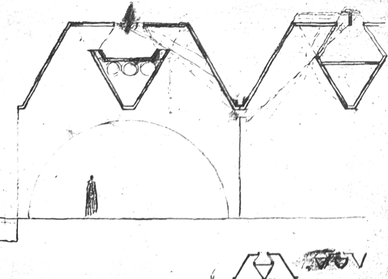
剖面示意图,1967年春季,显示“v形折板梁形成拱顶和顶光裂缝。“v”形的管道和光线(虚线)表明路易斯康对防止直射光进入画廊的关注。
Section sketches, spring 1967, showing’v-shaped folded plate girders forming vaults and top-light slits. The ‘v’-shaped ducts and the light rays (dotted lines) indicate Kahn’s concern for preventing direct natural light from entering the galleries.
KAM. 4
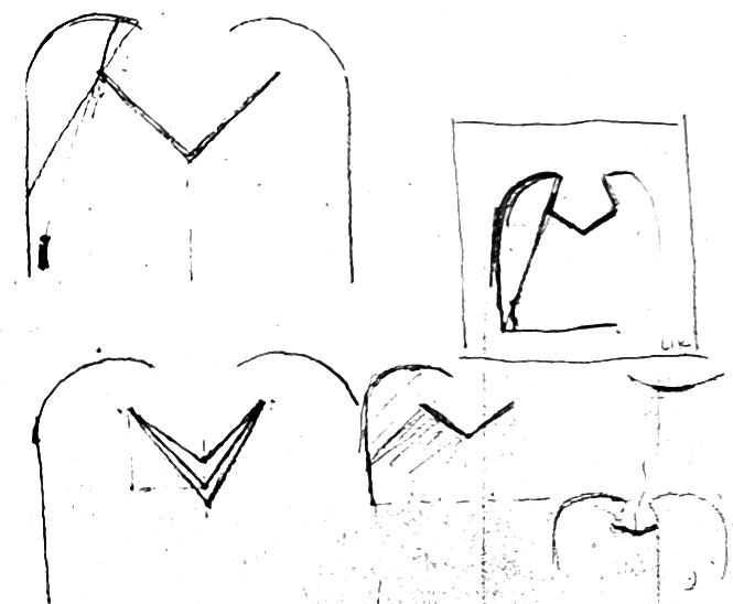
剖面,1967年3月。展示了弯曲拱顶中各种光反射器的研究。
Section sketches, March 1967.showing studies of various light reflectors in curved vaults. (For similar studies refer to YCB. 25- 29.p.384.)
结构是光的赋予者.
Structure is the giver of light.
矩形方案
RECTANGLE PLAN
KAM.5
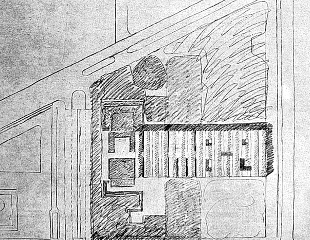
场地示意图,1967年,展示了15跨的拱顶结构,没有顶部的裂缝,但有采光庭院,现有的树木和带有水池的入口广场(向西)。土地由沃斯堡市捐赠,是9.5英亩的阿蒙·卡特广场的一部分,包括阿蒙·卡特西方艺术博物馆,沃思堡艺术博物馆,沃思堡科学博物馆和历史,威廉斯科特剧院,罗杰斯纪念体育馆和礼堂。 金贝尔艺术博物馆北临坎普·鲍伊大道,东临阿奇·亚当斯街,南临兰开斯特大道,西临威尔·罗杰斯街
Site plan sketch, 1967, showing fifteen-bay curved vault roof structure without toplight slits but with light courts, existing trees and entrance plaza with water-pools (to the west). Land for the site of the KimbellArt Museum was donated by the city of Fort Worth, and was part of the nine and one half acres of The Amon Carter Square Park-the city cultural center accommodating The Amon Carter Museum of Western Art, The Fort Worth Art Museum, The Fort Worth Museum of Science and History, The william Edrington Scott Theater, The Will Rogers Memorial Coliseum and Auditorium, and The Casa Manana Theater.The Kimbell Art Museum site is surrounded by Camp Bowie Boulevard to the north, Arch Adams Street to the east, West Lancaster Avenue to the south and Will Rogers Street to the west (refer to KAM. 36).
H型平面方案
H-PLAN: FIRST VERSION
KAM. 7 KAM.8
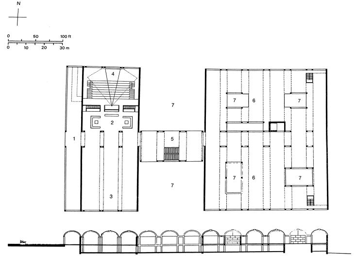
1入口门廊
2接待,书店和商店
3专题展览馆
4礼堂
5拱廊及楼梯
6间展览馆(办公室、图书馆及以下文物修复)
7灯光和雕塑场地
入口一层平面图。1967年夏,展示十三跨结构:左边为四跨入口和礼堂建筑;右方六跨画廊;以及连接建筑的三个隔间,中间有一个楼梯。东西走廊定义了中央入口轴线,并将博物馆分为南北两个部分。
First floor plan at entrance level. summer 1967, showing thirteen-bay structure: four-bay entrance and auditorium building to the left; six-bay gallery building to the right; and three-bay connecting building with a stair in the center. The east-west corridor defines the central entrance axis and allows the separation of the museum into north and south sections.
Longitudinal section, facing north, through light and sculpture courts, summer 1967, showing light-reflecting waterpool and en-trance portico to the left, the light and sculpture courts, and curved vaults with toplight slits and ducts to the right.
- 1 Entrance portico
- 2 Reception, book store and shop
- 3 Special exhibition gallery
- 4 Auditorium
- 5 Arcade and stair
- 6 Galleries (office, library and conservation below)
- 7 Light and sculpture courts
KAM. 9
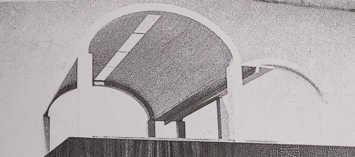
研究模型视图,1967年。每一个120英尺长的长跨度将由一对柱支撑的圆壳覆盖。34英尺宽的外壳结构被设计成梁而不是拱。这些壳将被连接起来形成拱顶,留下狭缝开口,让人们可以自由活动。管道空间设置在壳体底部水平的两个拱顶之间。
View of a study model, 1967. The long span of each 120 feet bay was to be covered by a pair of cylindrical shells supported by columns. The 34-foot-wide shell structure was to be designed as a beam and not as an arch. The shells were to be connected to form vaults leaving slit openings to allow toplight. The duct space was provided between two vaults at the bottom level of the shells.
“我的脑子里充满了罗马人的伟大思想,那拱深深地刻在我的脑海里,虽然我不能使用它,但它总是在那里随时准备着。而且拱似乎是最好的。我意识到,光必须来自一个最高点,最好在它的顶点。拱顶并不高,不是庄严肃然,而是与个人的身材相称。我想到了家的感觉和安全。”
“My mind is full of Roman greatness and the vault so etched itself in my mind that, though I cannot employ it, it’s there always ready. And the vault seems to be the best. And I realize that the light must come from a high point where the light is best in its zenith. The vault, rising not high, not in an august manner, but somehow appropriate to the size of the individual. And its feeling of being home and safe came to mind.”
“一幅每天看都不一样的画,这幅画本身就想让你意识到它的品质。它不希望你只有一个印象。甚至它也被描绘在情绪中。因此,有一个明确的要求,自然光是显着的。窗户引起眩光;所以没有考虑侧窗。但是上面的光,也是最亮的,被认为是唯一可以接受的光。窗户变成了一条缝,用来改变光线的装置就在拱顶状的摆线结构上伸展开来。摆线结构不需要支撑,每隔100英尺就需要支撑一次,因为它可以充当一根梁。”
“A painting that you don’t see as well one day as you do another has a quality which the painting itself wants you to realize. It doesn’t want you to have the one-shot image. Even it was painted in moods. So, there is a definite demand that natural light be manifest. Windows cause glare; so windows were not considered.But the light from above, which is the most brilliant, was considered as being the only acceptable light. The window became a slit, and the device for modifying the light spread itself over the vault-like cycloid structure which needed no support except at every 100’, because it could act as a beam.”
KAM. 10
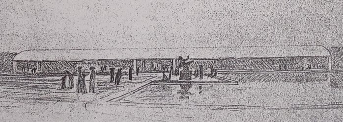
透视素描,1967年,展示入口广场,门廊和水池从西看。在水池边缘设计了一个特殊的壁龛,用于大型马约尔雕塑。
Perspective sketch, 1967, showing entrance plaza, portico and waterpool viewed from west. A special niche at the edge of waterpool is proposed for the large Maillol sculpture.
KAM. 11
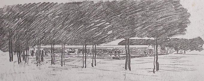
透视图,1967年,显示三跨入口/礼堂大楼。在这一阶段的设计完善,礼堂建筑包括门廊被减少到三个跨度。由于空间和估计成本超出了客户的计划和预算,在项目开发的每个阶段,建筑都在不断减少。
Perspective sketch, 1967, alternate version showing three-bay entrance/auditorium building (refer to KAM. 16-21)as viewed from southwest. During this phase of design refinement, the auditorium building including portico was reduced to three bays. Since the space and the estimated cost exceeded the client’s program and budget, the building was constantly reduced during each phase of the project development.
KAM.12-13
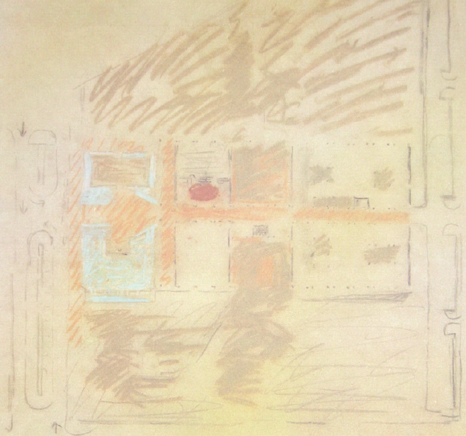
1967年的总图草图,展示了开放和覆盖空间的关系的研究。有一个明显的推敲问题是,让公园融入博物馆,而不把它分割成两个独立的部分。
Site plan sketches, 1967, showing studies of the relation of open and covered spaces for versions with a four-bay and a three-bay auditorium. There is the obvious problem of letting the park flow through the museum without cutting it in two separate parts.(KAM 25 12. original size 56.5 x 56.5 cm refer to Introduction).
KAM.14-15
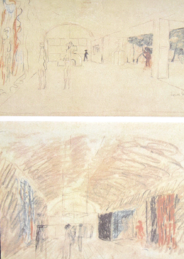
透视草图,1967年。显示在画廊室内设计的研究时间和晚上:没有采光缝。白天有天然的高光庭院,晚上则是人工照明。
Perspective sketches, 1967. Showing studies of gallery interiors at day time and at night:vaults without toplight slits. During the day there is natural high from light courts, and at night the exhibition is artificially lit.
H型平面,第二版方案
H-PLAN: SECOND VERSION
C型平面方案
C-PLAN: FIRST VERSION
KAM. 29
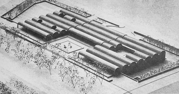
模型透视图,1968年秋季。1968年夏,制定了“c”规划,建筑分为南北两部分,中间为四跨入口建筑,南北长度增加60英尺,走廊转角90度。这允许建筑有两个入口:一层的主入口来自西庭,下层的服务入口来自东停车场。每个长拱顶长125英尺,宽25英尺。
Perspective view of site model, fall 1968. During the summer of 1968 the three-part’C’-plan was developed: the museum building of the’H’-plan was divided into north and south parts, and a four-bay entrance building in be-tween, increasing the north-south length by 60 feet, and turning the corridor 90 degrees. This allowed two entrances to the building: the main entrance from the west court at the first floor level and the service entry from the east parking lot at the lower level. Each long vault measured 125 feet in length and 25 feet in width.
KAM. 30
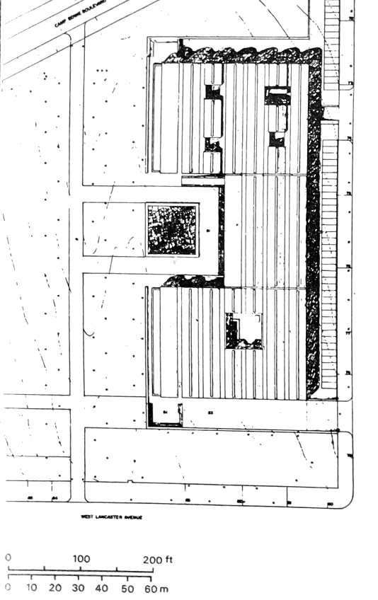
场地平面图,1968年9月25日,左边是现有的树木,入口庭院和广场水池,右边是停车场。
Site plan, September 25, 1968, showing existing trees, entrance court and square water pool to the left and parking to the right.
“从狭缝添加到天光展室里,我在拱顶区域裁切一个直角,庭院的对位,向天空开放,将它们标记绿色的庭院,黄色的庭院,蓝色的庭院,以光之名,我预计他们的比例,他们的原理,或他们的天空反射的表面,或在水会给。”
“Added to the skylight from the slit over the exhibit rooms, I cut across the vaults, at a right angle, a counterpoint of courts, open to the sky, of calculated dimensions and character, marking them Green Court, Yellow Court, Blue Court, named for the kind of light that I anticipate their proportions, their foliation, or their sky reflections of surfaces, or on water will give.”
KAM. 31
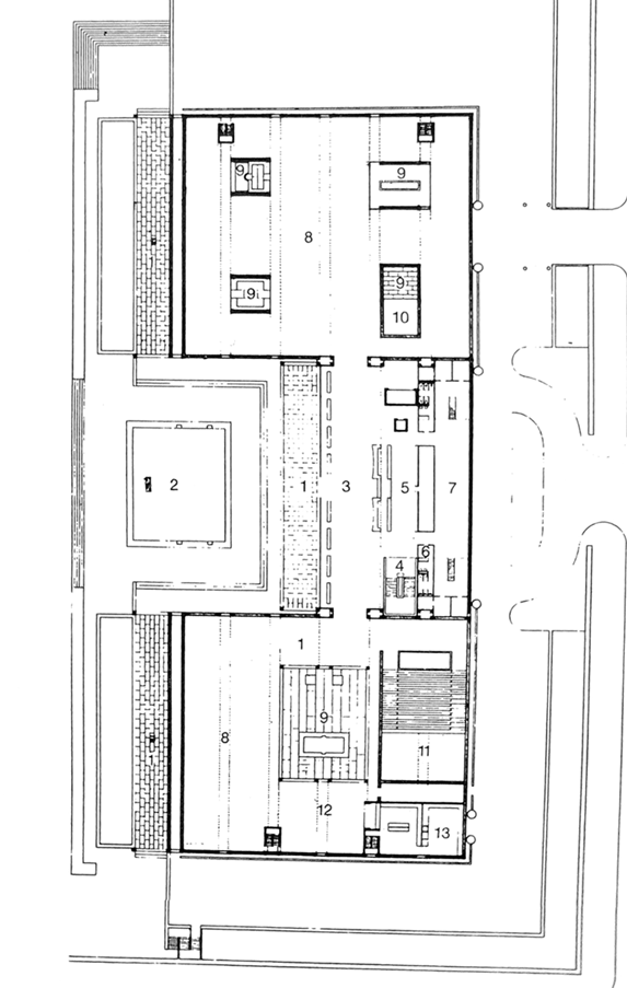
First floor plan, at main entrance level
- 门廊
- 入口广场/庭院
- 入口画廊
- 楼梯至低层
- 书店及商店
- 厕所
- 图书馆
- 画廊
- 光庭院
- 两层楼的管理员工作室的上部
- 礼堂
- 小吃店
- 厨房
- Portico
- Plaza/entrance court
- Entrance gallery
- Stair to lower level
- Book store and shop
- Toilet
- Library
- Gallery
- Light courts
- Upper part of two-story conservator’s studio
- Auditorium
- Snack bar
- Kitchen
C型平面方案 最终方案
Site plan sketch, June 25, 1969
“金贝尔太太,我希望这幅素描至少能帮助你把金贝尔·路花园的主要元素视觉化。”
“Mrs. Kimbell, I hope this sketch will help you visualize at least the main elements of the garden setting of the K.A. M, -Lou”
In a separate letter Kahn explained the garden setting for the museum:
“Dear Mrs. Kimbell: Wednesday, June 25,1969.
树林的入口是步行入口,连接着鲍伊营地大道和西兰开斯特大街,两个开放的门廊在露台的入口庭院旁边。在每个门廊的前面都有一个倒影池,它把水连续地滴在一个70英尺长的水池里,水池在两英尺以下。声音会很柔和。阶梯式的入口庭院在门廊和水池之间穿过,水池周围有一个喷泉,一个轴线被设计成门廊水池的源头。西草坪给了建筑一个远景。
The entrance of the trees is the entrance by foot which links Camp Bowie Boulevard and West Lancaster Ave, Two open porticos flank the entrance court of terrace. In front of each portico is a reflecting pool which drops its water in a continuous sheet about 70 feet long in a basin two feet below. The sound would be gentle. The stepped entrance court passes between the porticos and these pools with a fountain, around which one sits, an axis designed to be the source of the portico pools. The west lawn gives the building perspective.
南花园是在10英尺以下花园入口接洽逐步加强草坪的地方坐,看播放音乐或舞蹈的性能拱形的建筑轮廓作为一个舞台的背景,不使用的时候,它将作为一个雕塑花园。
The south garden is at a level 10 feet below the garden entrance approached by gradual stepped lawns shaped to be a place to sit, to watch the performance of a play music or dance the building with its arched silhouette is doing as the back drop of a stage, When not so in use it will seem only as a garden where sculpture aquired from time to time would be.
北花园虽然主要是实用主义的设计,但有充足的树木来保护和平衡建筑的南侧和北侧。
The north garden though mostly utilitarian is designed with ample trees to shield and balance the south and north sides of the buildings.
入口和停车场也在较低的一层,与阿奇亚当斯街平行。这一端也排列着树木,设计用来悬挂汽车作为遮蔽物。为此,我们必须选择正确的树,它的习惯是尊重汽车顶部。”
The car entrance and parking is also at the lower level, recessing parallel to Arch Adams Street. This end too is lined with trees designed to overhang the cars as shelter. For this we must choose the right tree whose habits are respectful to the car tops. “
KAM.. 37
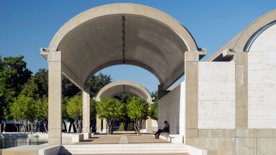
View of entrance court, porticos and light-reflecting pool from southwest.
“你知道那些门廊有什么好吗?”他们是如此不必要的。”
“You know what’s so wonderful about those porches? They’re so unnecessary.”
KAM. 38
Interior view, from the entrance hall of a gallery, showing cycloid vault with’natural lighting fixture’, air-conditioning duct and access to light court (to the right). White oak under the vault area and travertine under the ducts areas are used as flooring materials.
“建筑师最有价值的贡献来自自然的呈现。当一个建筑师意识到他从直觉的独特角度得到了一些东西时,这是他最大的乐趣。”
“An architect’s most worthy offerings come from the presentation of a nature. It’s the biggest fun of an architect when he realizes that he has gotten something out of his singular angles of the intuitive.”
KAM. 39
View of north facade, from Camp Bowie Boulevard.
“因为有开放式的门廊,所以在你进去之前,你会非常清楚这栋建筑是如何建成的。文艺复兴时期的建筑背后也有同样的认识,它把拱廊带到了大街上,尽管建筑本身并不需要拱廊来达到自己的目的。因此,门廊就坐落在那里,就像室内一样,墙壁上没有任何绘画的义务,实现了什么是建筑。当你看着这栋建筑和门廊时,它是一种奉献。你知道它没有功能;这是一种已经出现的东西。”
“Because of the open porches, how the building is made is comptetely clear before you go into it. It is the same realization behind Renaissance buildings, which gave the arcade to the street, though the buildings themselves did not need the arcade for their own purposes. So the porch sits there, made as the interior is made, without any obligation of paintings on its walls, a realization of what is architecture. When you look at the building and porch, it is an offering. You know it wasn’t programmed; it is something that emerged.”
“混凝土和石灰华的结合使建筑成为一个整体——当然不完全是这样,因为我们想通过材料的使用来体现建筑的结构:混凝土总是结构性的,石灰华总是填充性的。”
“The combination of concrete and travertine makes the building monolithic-not entirely so, of course, because we wanted to make the structure of the building manifest through the use of materials: the concrete is always structural, the travertine is always infill.”

