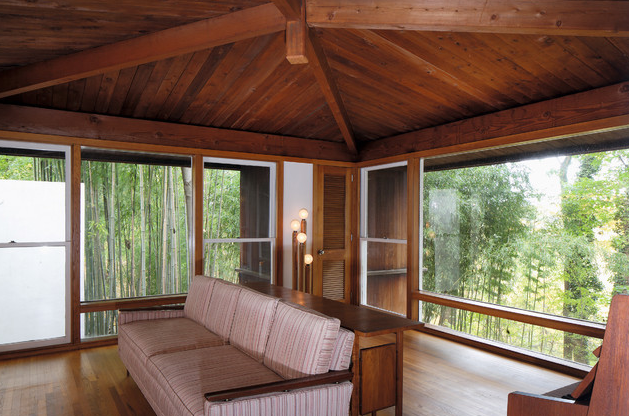
这个设计似乎是他的后罗马作品和他的“晚期”作品之间的过渡项目,伯纳德·夏皮罗住宅(1959- 73)。康之前的住宅设计主要通过“居住”和“睡眠”体量的分离来组织,夏皮罗住宅的最初和最终方案都引入了居住空间的逐步区分。这两种方案都是通过几何网格生成的——第一个方案基于一个8英尺的六边形网格,而第二个方案是由典型的正交网格派生而来的——但是每个方案之间的转换显示了从一个空间组织到另一个空间组织的清晰移动。

第一个方案的六角形网格显示了Anne Tyng具侵略性的对角线网格的强大影响。尽管如此,这似乎是他所有住宅设计中最真实的出发点。正如他在1973年所说,他的设计总是从一个正方形开始,并在此基础上不断进步;但在第一个夏皮罗方案中,卡恩似乎受到了六角形网格的约束,整合了规划元素,以适应尴尬的空间,从而产生了同样尴尬的副产物。早期的设计图纸几乎没有显示路易斯康典型的设计进程,仿佛网格决定了服务和服务空间的位置,并将建筑师减少到一个不断妥协的人。
乍一看,第二阶段计划似乎是特伦顿更衣室平面的一个更正交的版本。简单来说,平面是一个单一的体块,由一个中央服务核心划分成两个主要的生活空间。在典型的双层平面中,上层包含生活空间,而更私人化的下层包含睡觉空间。夏皮罗的房子展示了路易斯康迄今为止最简化的设计,将所有的仆人空间组织在中心核心。这种布局简化了垂直和水平的流线,使结构更加紧凑和统一。几乎对称的形式,该平面有一个逻辑和清晰的存在于一个完整的体量。这种逻辑粗暴地取悦路易斯康,因为他继续他的基本公式,在埃西里科住宅克住宅的设计。
夏皮罗的房子代表了路易斯康思想中一个明显的转变,而埃西里科的和费舍的房子真正标志着思想和建筑形式之间的融合。利用历史主题,路易斯康能够重新翻译传统主义,他可能认为内在的人类灵魂通过细节。正是这种对当地形式的重新翻译,加上现代技术的创新,使路易斯康能够在帮助他形成一个完全独特的建筑的同时,对每个空间进行定义
The design that appears to have been the transitional project between his post- Rome work and what I will refer to as his ‘late’ work is the Bernard Shapiro house (1959- 73). Where Kahn’s previous residential designs were predominately organized by the separation of ‘living’ and ‘sleeping’ volumes, both the initial and final schemes for the Shapiro House introduce a progressive rationalization of habitation spaces. Both schemes were generated via geometric grids – the first scheme based on an 8-foot hexagonal grid, while the second scheme was derived from a typical orthogonal grid – but the transition between each shows a clear movement from one spatial organization to the other.
The first scheme, with its hexagonal grid, exhibits the strong influence of Anne Tyng and Kahn’s movement toward a more aggressive diagonal grid. Nonetheless, it appears to have been the most literal starting point of any of his housing designs to that point. As he stated in 1973, he always began his designs with a square and progressed from there; but in the first Shapiro scheme, Kahn seemed constrained by the hexagonal grid, consolidating programmatic elements to fit the awkward spaces, which induced equally-awkward bi-products. The early design drawings present little evidence of Kahn’s typical design progression, as though the grid dictated the placement of served and servant spaces and reduced the architect to a continuous compromiser.
At first glance, the second phase scheme looks to be a more orthogonal version of the Trenton Bathhouse plan with various recessions. In its simplest terms, the plan is a single rectilinear volume divided into two main living spaces by a central servant core. A bi-level plan organized in typical Kahnian division, the upper level contains spaces for living while the more privatized lower level contains spaces for sleeping. The Shapiro House exhibits the most simplified version of Kahn’s devices to date, organizing all servant spaces within the central core. Vertical and horizontal circulation is simplified through this placement, enabling a more compact and uniform structure. Virtually symmetrical in form, the plan has a logic and clarity that exists within a fully integrated volume. This logic surly pleased Kahn, as he continued the basic formula in his concurrent design for the Margaret Esherick House.
As will be discussed at length in Chapter Four, whereas the Shapiro house represents a noticeable transition in Kahn’s thinking, it is the Esherick house and the Fisher house that truly mark a progression toward a synthesis between the mind and the built form. Utilizing historic motifs, Kahn was able to retranslate the traditionalism he may have deemed intrinsic to the human soul through detailing. It was this retranslation of native forms, augmented by the innovations of modern technology, that enabled Kahn to characterize each space while aiding his formulation of an entirely unique architecture.
Pierson William Booher. (2009). Louis Kahn’s Fisher House: A Case Study on The Architectural Detail and Design Intent.Theses. University of Pennsylvania.
